Quick Take: Market Perspective in Two Charts

The stock market has become much more volatile in recent weeks and months and we thought we’d offer a brief perspective.
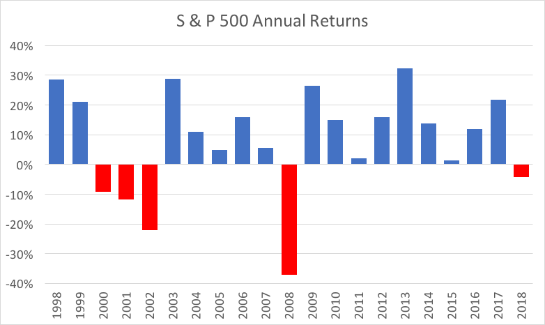
First, we know you’ve seen the headlines that market performance last year was the worst in a decade, based on the S&P 500.
That is true.
However, considering the fact that 2018 was the first year with a negative return since 2008, that statement doesn’t necessarily have much meaning. The S&P 500 fell 37% in 2008 and 4% in 2018, after having risen by more than 200% during that same decade. So, yes, last year was the worst in a decade, but not exactly a catastrophe.

In contrast to the S&P 500’s 4% fall in 2018, the average Yeske Buie portfolio lost about 9%. This is largely due to the fact that we construct global portfolios with a significant allocation to Overseas markets, which did worse than US stocks last year.
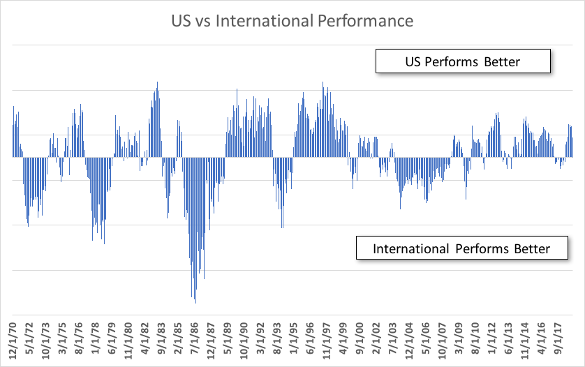
As you can see from the chart below, however, US and Overseas markets regularly (though not predictably) trade leadership.
This chart shows the relative performance of US and International Markets, with bars on the top indicating periods when the US performed better and bars on the bottom showing those periods when Overseas markets did best. As you can see, neither dominates forever and a truly diversified portfolio must include both.

