Inflation (yep, again) – An Investigation of Three Charts

Here we go again. Today, the Bureau of Labor Statistics released its reading on the inflation rate over the past 12 months. The Consumer Price Index (CPI) rose by 5% (4.7% expected), the largest increase since 2008. Core CPI, which accounts for the price increase of all items except food and energy, which are more volatile, also rose by 3.8% (3.5% expected).
Perhaps somewhat unexpectedly, financial markets seemed to shrug the news off – the major US indices were up for the day. It’s here that we’ll note the inflation rate over the past 24 months is 2.5%; while the figure for the past year captures price increases from the depths of the recession to the peak of the recovery (thus far), the two-year figure paints a much tamer picture.
In our recent posts, we’ve noted that we’re not concerned about the long-term ramifications of a transitory surge in the inflation rate. Today, we’ll share more about our position via a story told by three charts. The charts look at a few economic indicators across each of the last three recessions. We isolated the information from each period by identifying three checkpoints and observing what happened in between:
- The relative peak in financial markets preceding the respective recession;
- The date markets reached their respective nadir; and
- How things looked 15 months after markets reached their relative low point (because that’s about how far we’ve come since markets last bottomed out in March of 2020).
Each chart tracks the rate of change of four components:
- US Initial Claims for Unemployment Insurance (purple)
- US Unemployment Rate (orange)
- US GDP (blue)
- US Inflation Rate (green)
The charts measure the rate of change of each indicator. In other words, they illustrate when things start to get better or worse based on the way the shape of the curve is changing direction.
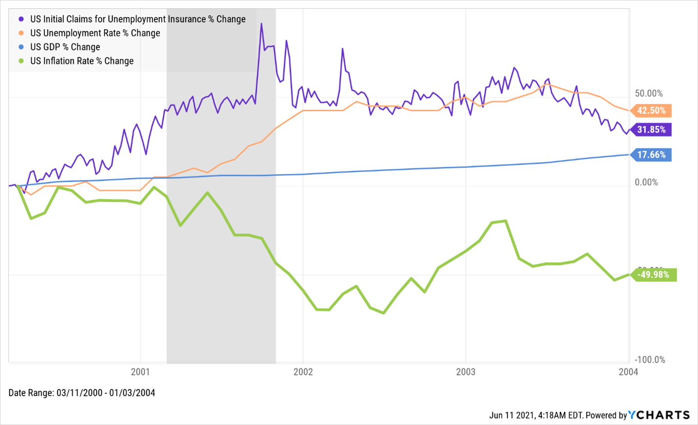
Dot Com Meltdown
- Market Peak: March 10th, 2000 (NASDAQ)
- Market Bottom: October 9th, 2002
What happened:
- Around the time financial markets bottomed out, the increase in the rate at which people were making claims for unemployment insurance peaked. Note that both of these events more or less coincided with the end of the recession, illustrated by the gray area on the chart.
- Shortly thereafter, the rate at which the unemployment rate was increasing began to flatten out, as relatively fewer workers were filing for unemployment insurance.
- Throughout the period, the rate at which economic output was growing (as measured by GDP) increased steadily.
- And at about the same time as when things hit bottom in the financial markets, the inflation rate decreased at its fastest rate; over a period of almost four years, the inflation rate fell from 3.8% in March of 2000 to 1.9% at the end of 2003.
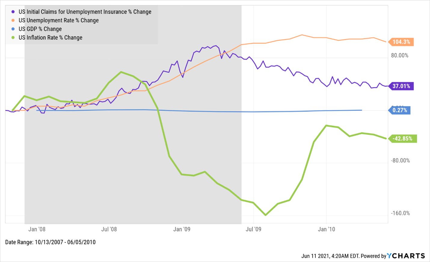
Financial Crisis:
- Market Peak: October 9th, 2007 (DJIA)
- Market Bottom: March 9th, 2009
What happened:
- In a sense, almost exactly the same thing – a bubble popped and financial markets and the economy reacted accordingly. Interestingly, the charts look pretty similar even though the details of each recession were unique. And the similar observations as the ones we made about what happened during the Dot Com Meltdown can be applied to the Financial Crisis. Two key differences to note: this recession lasted almost twice as long, and the downswing in financial markets was significantly worse.
- Financial markets reached their low point in March of 2009, right around the time the rate at which claims for unemployment insurance began to level off and the rate at which the unemployment rate was increasing also flattened out. Note that the recession ended just a few months later, a similar timing of events relative to what we saw with the Dot Com Meltdown.
- The growth rate of economic output for the period was effectively nonexistent, partly reflecting a larger dip in GDP relative to what we saw a few years earlier. And yet, GDP recovered and exceeded pre-recession levels by the end of the period.
- And again, as markets were finding their relative bottom, the inflation rate decreased at its fastest rate. Over a period lasting longer than three years, the inflation rate dropped from 3.5% to 2%.
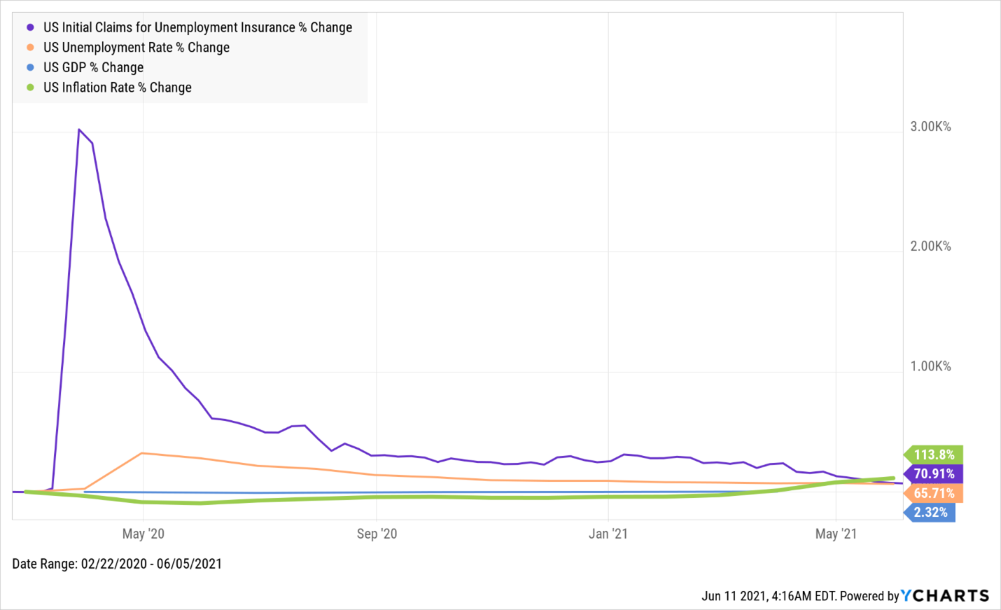
COVID:
- Market Peak: February 19th, 2020 (S&P 500)
- Market Bottom: March 23rd, 2020

What happened:
- As a result of the country going on lockdown, the halt in economic activity was dramatic, as illustrated by the curve showing the rate at which claims for unemployment insurance increased (3,000% – not a typo). And that increase happened effectively overnight.
- As you would expect, the unemployment rate shot up as well.
- GDP was back to pre-recession levels by the end of 2020.
- Just as with the last two recessions, things began to improve dramatically as measured by these indicators as soon as markets reached their relative bottom in late March.
- Unlike what we saw in the previous charts, inflation has increased steadily over this 16 month period, growing from 2.3% to 5%.
So what gives? As it relates to inflation, why are we seeing something different in the recovery from this recession relative to the last two recessions?
Because the circumstances are different. Rather than a bubble bursting (whether it was overpriced tech companies in the early 2000s or unsustainable circumstances in the real estate market a few years later), an external shock in the form of a deadly virus (and subsequent global pandemic) rocked markets and economies around the world. And, as it relates to the US, markets and an economy that were, prior to COVID, humming along. Recall that financial markets were at all-time highs in February 2020 and the unemployment rate was 3.5%.
So that helps us understand why this time looks different, and perhaps even why it feels different. And that doesn’t mean that we should be doing anything different.
Yes, prices have increased. Everything from diapers to gas to lumber is more expensive. But the reason behind what consumers are experiencing is the same reason this third graph looks different from the other two: this recession isn’t like the previous two recessions (although it’s technically not even over yet, it may have only lasted a month), and this recovery isn’t like the previous two recoveries. This recovery is about returning to an economic state where things were functioning healthily; there was no singular underlying financial or economic issue threatening the economy like in each of the two prior scenarios. In this case, something shocked the system and it ground to an almost immediate standstill. And then it rebounded nearly as quickly. But not without some challenges that specifically affect things like inflation in a significant way.
Take, for example, the supply chain issues caused by the pandemic that have been making headlines for over a year, which can cause transitory spikes in prices because there aren’t enough goods available for consumption at a given place in a given moment. And that’s before accounting for some of those supply shortages being met with pent up demand from Americans who’ve saved more than $1.36 trillion in the past year and haven’t been able to go anywhere to spend it. Those two factors alone are enough to send prices upward for a while.
And we haven’t yet mentioned the trillions of dollars of stimulus (read: economic life support); we think the fact that inflation is only at 5% reflects just how necessary the actions taken by the Fed and Congress were, and how big of a hole we might otherwise be in. Put another way: the policy decisions enacted in response to the crisis appear to have been appropriate, and the relatively muted levels at which prices have increased given the context of the rest of the recovery fit with that story (especially as compared with 2019 price levels).
One more thing to keep in mind is how quickly all of this has happened. Recall that the charts above regarding the Dot Com Meltdown and Financial Crisis spanned several years – the onset of the pandemic, the stock market crash, the beginning of the recession and the recovery (to this point) has all happened in 16 months. So the speed at which things are settling down affects how the process looks. In other words, bigger numbers aren’t always as scary as they appear.
We’re already seeing encouraging signs about the health of the recovery. We point back to the falling unemployment rate (down to 5.8% from its peak of 14.8%) and the reductions in initial claims for unemployment insurance, which have fallen for six consecutive weeks and this week clocked in under 400,000 for the first time since the pandemic began, down from a peak of nearly 7 million in March of last year. Yes, wages are increasing, and in a vacuum one could argue that upward pressure on wages is a reason to worry about inflation. And yet there are still millions of jobs that have yet to be recovered, and many believe there’s more slack in the labor market than the numbers indicate. Still, economic output is on the rise, with predictions for GDP growth exceeding 7% for the year, which would be the highest rate since 1951. Oh, and financial markets are back to being at or near record levels.
We’re not saying that there’s nothing to worry about – there are still challenges that lie ahead. And yet if we zoom out and look at the big picture, it isn’t shocking that the reverberations from the most dramatic shock to the economic and financial systems we’ve seen in a century are also a bit…dramatic. That’s the way aftershocks work. Ultimately, things settle down (until the next shock to the system).
So what should we do in the face of this most recent bit of news? Just as we’ve been doing with all of the other information we’ve had to digest over the past months and years, we should put it into its proper context. And then move forward.


