Digesting Your Monthly Portfolio Reports


During the first few business days of every month, we post performance reports for all YeskeBuie Client accounts to our Client Private Pages. While we don’t recommend obsessing over investment performance, it’s important to us that the information available on the Client Private Pages displays accurate and timely information when Clients choose to view their page. For some, however, reading the information on the reports can feel like trying to read Greek. In this piece, we:
- Breakdown the information available on each page of the reports.
- Compare situational examples and the impacts on the reports.
- Answer a few commonly asked questions.
We hope you find this breakdown helpful!
Accessing Your Performance Reports
Login to your Client Private Page here using your unique login credentials. Once logged in, you can find your portfolio performance reports posted under the “Invest Big” dropdown. You’ll see under “Performance Reports” a link to a global report as well as links to reports for your individual accounts. The global report combines all the data from each separate account to create a summary of the overall portfolio performance. We are going to review a sample global report, but you can also use this as a guide to reviewing each of your accounts individually. Let’s get started!
Portfolio Allocation
On the first page of our portfolio reports, you will see the PORTFOLIO ALLOCATION page, which shows a pie chart that represents the allocation of the portfolio. The four sections of this chart are Cash Equivalents, Global Bonds/Fixed Income, Global Large Cap Stocks, and Global Small Cap Stocks.
Each of the blue sections of the chart, Global Large and Small Cap Stocks, are also further diversified. If you take the Global Large Cap Stocks section and divide it approximately in half, one half will be mutual funds that invest in US stocks and the other half will be mutual funds that invest in International Stocks. If you then take each of those halves and divide them in the middle again, about 50% of that section will be in a broad market index fund (the S&P 500, for example) and the other 50% in a value fund. In the end, the Global Large Cap Stocks section includes the following fund categories: US Large, US Large Value, International Large, and International Large Value. You can repeat this same process on the Global Small Cap Stocks section of the piece chart as well.
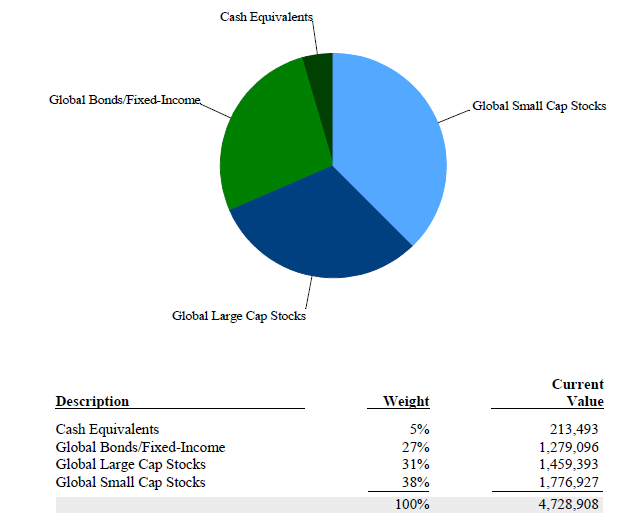
Underneath the pie chart, you will see the (1) Description, (2) Weight, and (3) Current Value of each of the four sections in the portfolio.
Portfolio Statement
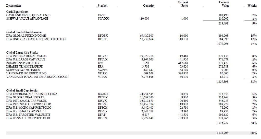
Page two of the portfolio reports is a snapshot of all the funds in your portfolio. This page includes the (1) Description of the holding, (2) Symbol (or ticker) for each holding, (3) the Quantity (or number of shares you hold in each position), (4) the Current Price of one share (as of the published date), (5) the Current Value of that position, and (6) the Weight of that position in the portfolio.
Performance Graphs
Starting with the graph on the left-hand side of the page, the Graphical Comparative Performance Illustration shows the cumulative return of the portfolio (blue) against the benchmark (green).
For the stock portion of our portfolio, we use the Morgan Stanley Capital International All Country World Index (MSCI ACWI). We use this index because it is geographically neutral, meaning that it allocates different countries based on their relative share of the global stock market, just like we do in our portfolios. The spread between your portfolio and the benchmark can almost exclusively be explained by our intentional tilt towards small company stocks and value stocks, such that their respective weights in our portfolio are greater than their actual weight in the global market. You can learn more about our investment philosophy here.
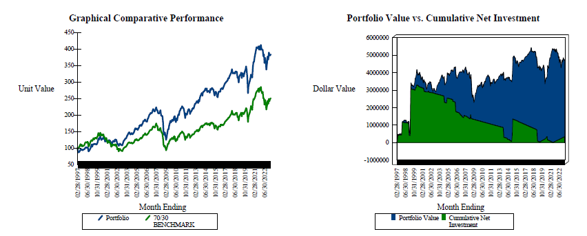
The graph on the right of this page illustrates the portion of the portfolio value that is from net investments. On this graph, the green portion reflects the Cumulative Net Investment (in other words, the principal; what was contributed and then subsequently was distributed from the portfolio). You’ll notice that in this example the green portion of the graph has an overall downwards trend. This illustrates the withdrawals from the account. You can see that in 2014 there was an addition to the account, causing that section of the graph to increase.
The blue portion reflects the portfolio value, meaning that when the blue section is on top of the green, that represents the portion of the portfolio that is investment returns. In the graph above, you’ll notice that over time the portion of the graph becomes a bigger portion of the overall value. As you can see, the net investment in this portfolio has decreased significantly as this sample Client has spent from the portfolio. If the green section of the portfolio disappears from the graph, that means that the Client has spent more than they originally deposited into the portfolio and the portfolio is fully supported by the investment return over time.
Now, what might this Cumulative Net Investment graph look like with a portfolio with a shorter time horizon? Below we have included a sample report as if a Client started inventing with us in November 2022. As you can see, the blue portion of the graph is only slightly higher than the net investment, meaning that right now the portfolio is made mostly of the initial investment and only a portion of the account is from investment gain, but over time we’d expect the graph to begin to look more like the first example.
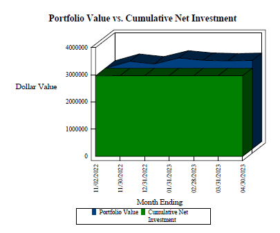
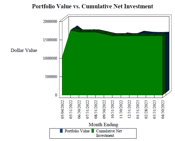
Before we move onto the next section of the portfolio reports, we also wanted to show another variation of the Cumulative Net Investment graph. This image is, again, for a sample Client with a shorter time in the portfolio. You’ll notice that from around June 30th, 2022 to January 31st, 2023, the blue portfolio value section disappears behind the Net Cumulative Investment section. This means that the portfolio had an overall negative return during that time and the value of the portfolio was less than the original investment.
Comparative Performance Report
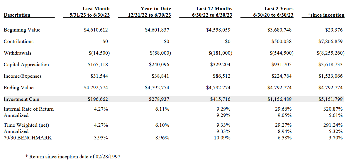
On this page of the portfolio reports, you can compare the overall performance, and some other criteria over the following time frames: (1) Last Month, (2) Year-to-Date, (3) Last 12 Months, (4) Last 3 Years, and (5) Since Inception. If you’ve been working with us for fewer than 3 years, some of the comparison columns will look identical.
For this page, we wanted to answer some of the more common questions:
- “What is the difference between Internal Rate of Return and the Time Weighted Return?”
Internal Rate of Return: The Internal Rate of Return (IRR) is also known as the “Dollar-Weighted” Return and it measures the performance of your portfolio based on how many dollars are invested at any one time. For example, if you had a modest sum invested during the first month and then made a deposit that doubled the size of your account at the beginning of the second month, the second month’s return would carry twice as much weight as the first month’s in the calculation of your overall return. The IRR is more reflective of the actual dollar gains earned in your account. This return illustrates the performance of your specific portfolio.
Time Weighted Return: The Time-Weighted Return (TWR) is calculated as if there was a constant dollar investment in your account. In doing so, it ignores the effects of deposits and withdrawals that you may make. Unlike the IRR example above, the TWR would ignore the deposit made at the beginning of month two and give equal weight to the returns earned in each of the two months. This return illustrates the performance of the overall strategy.
- “What is included in the Income/Expenses row?”
The income reported in that row of the report would include capital gain distributions, interest, and dividends. The most common expense reported would be trading fees or any interest owed on a margin loan taken from the account.
- “Do we need to account for your management fee when looking at the performance returns?”
No. We report all our returns net of management fees so that you can see your “real” return.
Performance of Individual Holdings
This page reports on all funds that have been included in the portfolio over the trailing 12-months. To illustrate what the report means, take the image below, showing the Global Small Cap Stocks for the sample report.

Starting on the top row with DFA U.S. Small Cap Value, you’ll see that the first time this position was included in the portfolio was 10/29/2007. Twelve months prior to this report being run, in this case 4/30/2022, the value of the position was $95,765. Over the past 12 months, $6,434 of the position was sold, gains of $4,998 were realized, and the position currently has an unrealized loss of $5,833. Income, in the form of capital gains distributions and/or dividends, totaled $1,436. When you combine all the numbers, you get to a current value of $89,932.
Transaction Ledger Report
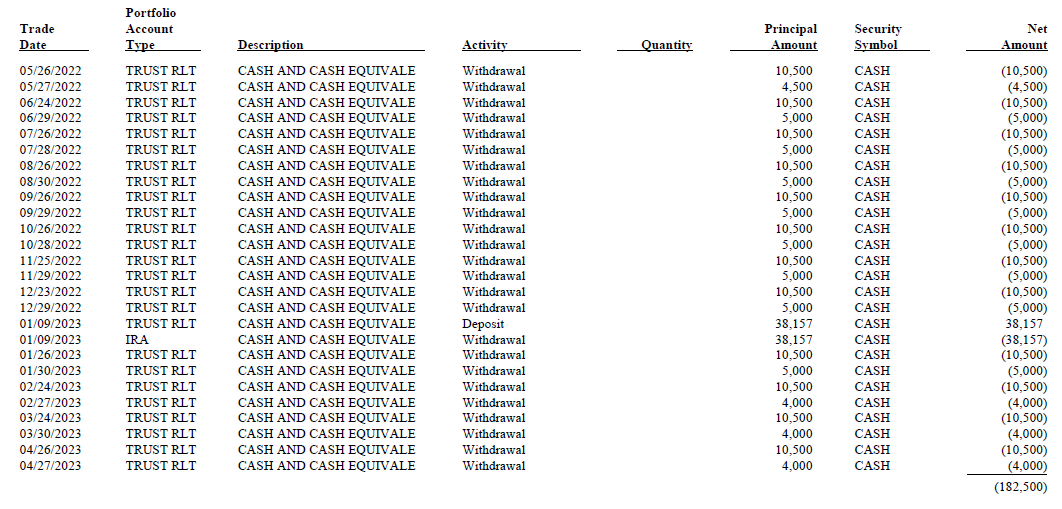
The transaction ledger reports all withdrawals and deposits in the portfolio for the trailing 12-month period. In the example below, you’ll notice that on January 9th, 2023, there was a withdrawal from the IRA and a deposit into the trust account in the same amount. This is an example of when we transfer money between two Schwab accounts. In this particular case, we withdrew the Client’s Required Minimum Distribution from the IRA and deposited it into the trust. These two transactions cancel each other out from a reporting perspective. This is a great example of how the individual portfolio reports work together to create a full story. If you were to look only at the report for the IRA, rather than the global report, you wouldn’t see the relationship between those two transactions.
Unrealized Gains and Losses
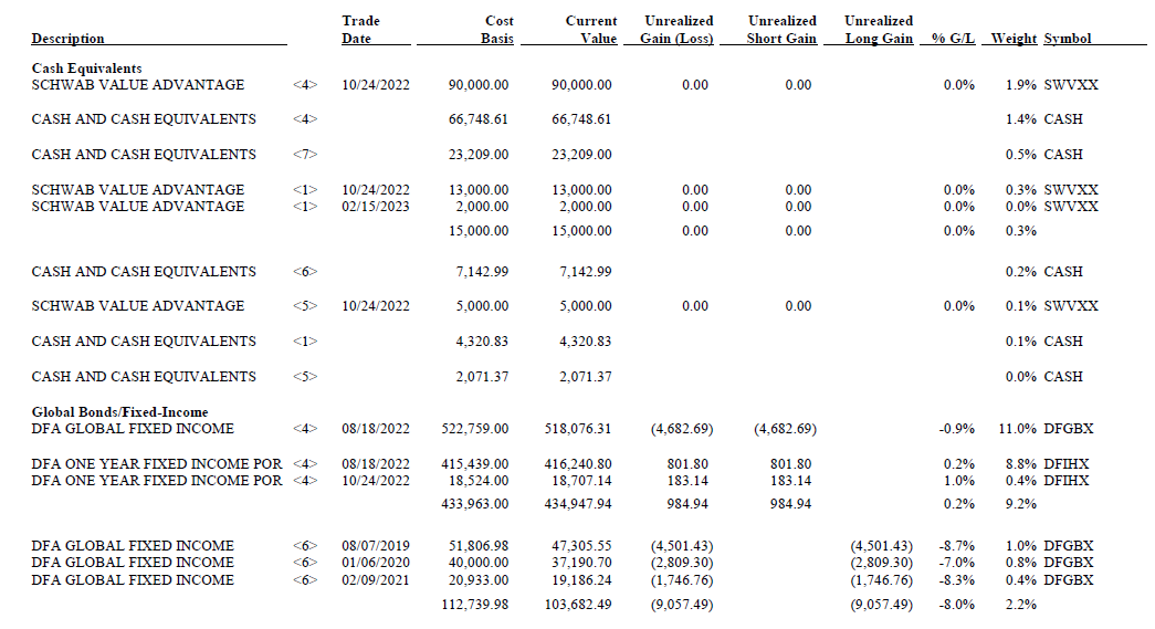
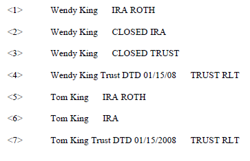
This report shows an overview of all the positions currently held within the portfolio. If you’re reviewing the global report, you’ll notice a <#> symbol between the first and second column. There is a key on the last page of the unrealized gains and losses reports that tells you which account matches each number. Here you can see (1) the Description of each position, (2) the Trade Date, (3) the Cost Basis, (4) the Current Value, (5 -7) the Current Unrealized Gains and Losses in each position, as well as the (9) Weight of each position within the portfolio.
In addition to the reports we generate and post to your Client Private Page®, you also have access to monthly statements from the custodian, in most cases Charles Schwab. While we think the statements provided by Schwab are useful, we think our reports allow you to get a better understanding of your actual performance.
If you ever have questions regarding your portfolio reports, please contact us and we’d be happy to schedule a meeting to review yours in more detail.
